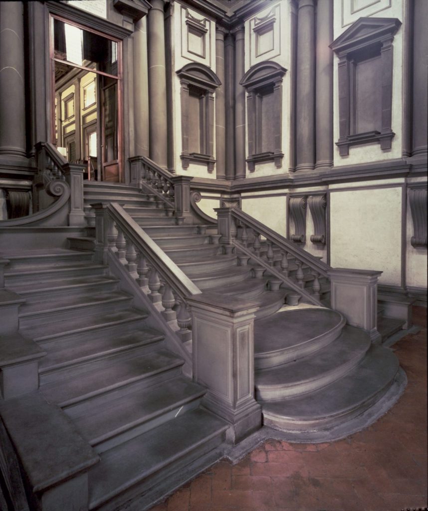
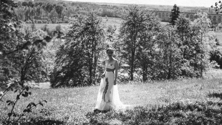
In the vestibule of Florence’s Laurentian Library, Michelangelo’s classical design is of magnificent claustrophobia; windows and doors filled with stone. A few hundred metres away, at what is now the Museo di San Marco, what used to be monastic cells have small windows to the sky, but are essentially enclosed, solitary rooms.
No wonder these locations appealed to a painter who would feel his way to wall-sized works drenched in colour but less reliant on external light than on their own, mysterious in-built illumination. The Russian-born artist Mark Rothko was captivated and inspired by both when he made the first of his three visits to Italy from his adopted US home.
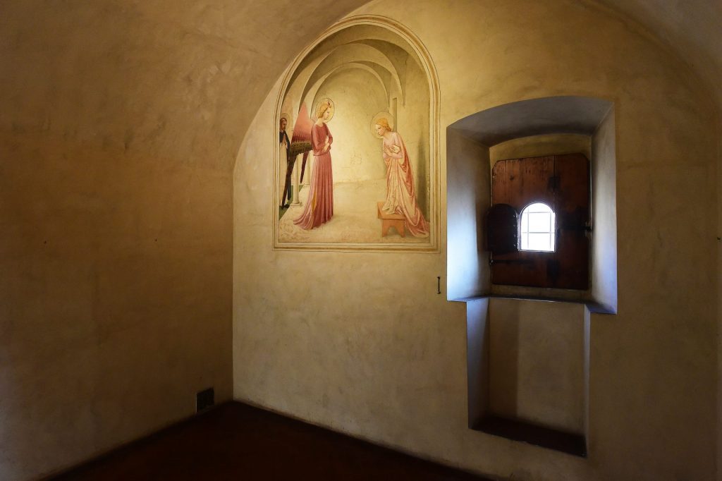
L-R: Fra Angelico’s fresco The Annunciation
Rothko came to Florence twice, on a low budget as a struggling artist in 1950, then in 1966 as a celebrity taking a break from the 14 paintings made for his Rothko Chapel in Texas. Now he is back with a blockbuster exhibition of his work at the Palazzo Strozzi, one that also has small satellites at his old haunts.
In 1950, he was so consumed by the San Marco cells that he ran out of time and had to come back the next day. The Laurentian Library vestibule, meanwhile, “had exactly the feeling that I wanted… it gives the visitor the feeling of being caught in a room with the doors and windows walled-in shut.”
Suggested Reading
How the world finally caught up with Beatriz González
The exhibition retraces Rothko’s artistic journey and also focuses on the importance of his physical travels, particularly to the land of Michelangelo and Fra Angelico, the artist monk who painted contemplative images on the walls of his brother monks’ cells at what was then the Convent of San Marco.
It is presented chronologically, and whereas the very name Rothko immediately conjures up seas of rich, deep colour, his early paintings reveal certain traits from the outset. In a self-portrait, painted in 1936 in the hallmark red, brown, maroon and black of his later work, at 33, he looks older, grim-faced in dark glasses. Untitled (Cityscape) in the same year shows a high-rise block with impenetrable windows and no sense of human occupation.
These severe images may be partly a reflection of a still young man’s natural gloom. But within a few years, Rothko, who was born Marcus Rothkowitz to Russian parents, had married, changed his name, and been granted US citizenship. Against this happier background, in the 1940s he introduced animated figures, his own additions to the natural world, brightly vivacious and inventive.
These biomorphic fantasies, with their tendrils, spots and spawn, seem far removed from the colour field paintings on which his reputation is built, but they are a waymarker to abstraction. In 1944, the breasts of Tiresias break free, and two years later, Room in Karnak, which he had not visited in real life, relishes the disembodied eyes and featureless face of hieroglyphs, the enclosed doorways, masonry, and hints that air passes but does not enter or leave.
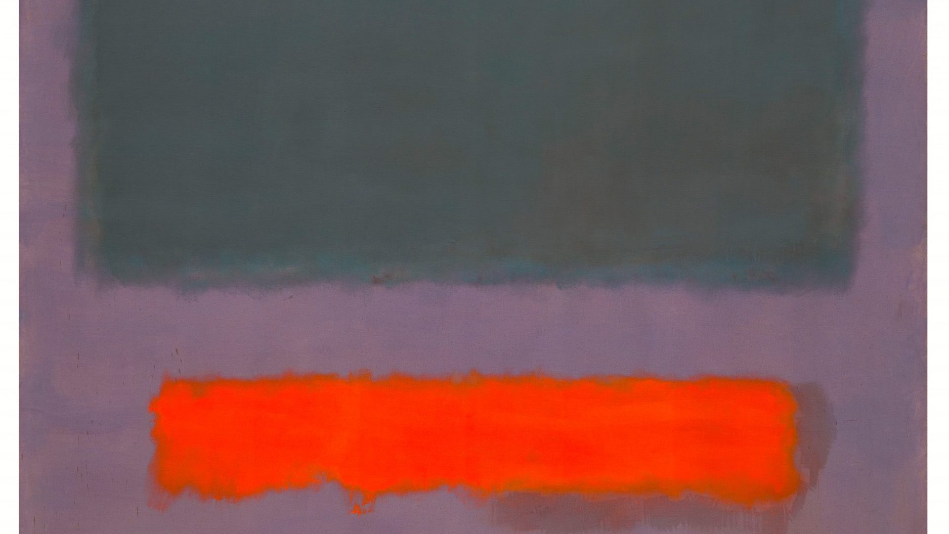
Bit by bit, Rothko was leaving behind representation and the figure. Floating motifs swelled and settled into “multiforms”, so that in 1949 he broke into a new decade and a new half-century with bands of pure colour: purple over a strip of white, resting on a black that holds its ground, as green appears to drop through red and come to rest on a ribbon of yellow. No 3/No13 (Rothko’s titles become deliberately non-descriptive), on loan from the Museum of Modern Art in New York, feels like a pivotal moment. More were soon to follow.
In 1950, inheriting money after the death of his mother-in-law, he boarded the RMS Queen Elizabeth with his wife, Mell, for a five-month trip that started in Paris and moved on to Venice, Rome, Florence, Siena and Arezzo. In Florence, he came face to face with the frescoes of Giotto di Bondone (1267-1337) and Fra Angelico (1395-1445), and found in the cool Laurentian Library not tranquillity but intensity. He would aim for the latter, not the former, in his own work.
Painted on a giant scale in the vast loft spaces in New York that artists of his generation commandeered, Rothko’s canvases were designed to be absorbed close up – so close that the edges disappeared from view. This is hard to do in a gallery with fellow visitors and security ropes, but Untitled (1952/53), loaned by the Guggenheim in Bilbao, is, at around five metres by three metres, so huge that it is easy to immerse oneself in the flag-like reds and yellows.
In this expanse, tiny dribbles of paint emphasise the overall scale. Rothko’s work is big, but it contains minute elements – the light-as-air feathering as one colour morphs into another, the glittering specks inside No 14 (Browns Over Dark), painted in the early 1960s.
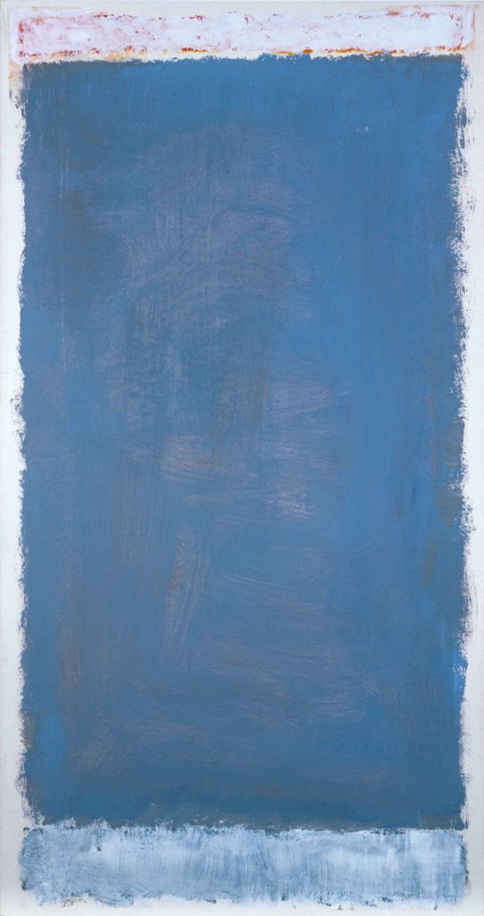
By this time, Rothko’s star was firmly in the ascendant. His first solo show in 1947 was swiftly followed by exhibitions, often with other groundbreaking American artists, in the US and across Europe. Reds and yellows were giving way to blues and greens – the key to sea, sky and landscape in other artists’ hands, but to hypnotic potency in these.
His second trip to Italy came in 1959, sailing to Naples on the Independence, and returning via London and Cornwall. During the voyage out, he and Mell made friends with the Harper’s journalist John Hurt Fischer and his wife, undertaking some excursions with the couple, including to Pompeii and Paestum, of which Rothko said: “I have been painting Greek temples all my life without knowing it.”
Suggested Reading
The artist and the blind prophet on Europe’s frontier
By now he was working on a series of vast paintings for the Four Seasons restaurant in New York’s new Seagram building, designed by a team led by Ludwig Mies van der Rohe. But upon his return to New York, Rothko and Mell went to dinner in the restaurant, already open to the public, even without its artwork.
Rothko, horrified by their fellow diners, abandoned the commission and returned the advance. It is not hard to see why he threw in the towel, unwilling for only the wealthy to eat their fill while treating his work as wallpaper. It is harder to understand why he accepted the commission in the first place, since its parameters appeared not to have moved.
You can walk into any number of galleries across the western world and be stopped in your tracks by at least one Rothko: in Britain, Tate alone has 14. Admittedly, these include nine of the Seagram murals, donated by the artist, who died by his own hand on the day of their arrival by sea.
But it is less common to see his fine filigree sketches, revealing another side to his artistry. With pen and ink, not a loaded brush, he sketched ideas for balance, proportion and tension between planes, groundwork for later paintings. Briefly we see once more the hand that traced out the fragile, swimming contours of the 1940s biomorphic figures. With gossamer exploratory lines, he can make the world of difference between a form divided roughly into half, and one with unequal parts.
It is in these drawings that we see reflected the impact on Rothko of architecture – above all of the Italian Renaissance – which underpinned his art although he did not work in three dimensions.
His third visit to Italy in 1966 would be his last. He admired Giotto’s tableau-like scenes in Assisi, but unlike most modern artists was less enamoured of Piero della Francesca, pronouncing himself disappointed by Piero’s incident-filled frescos in the church of San Francesco in Arezzo. (Perhaps, undoubtedly having studied her as a young artist, he was more drawn to the pregnant Madonna del Parto in Monterchi: his Portrait of Mary wears the same blue gown and loaf-like hat/halo while nursing her swelling belly.)
Suggested Reading
The woman who put a lobster on the Duchess of Windsor’s groin
The stern Laurentian Library continued to exert its influence, even though he did not revisit it. “He does not need to see it,” observes his son, Christopher. “He has fully internalised the tactile memory of his time in Michelangelo’s windowless room.”
Rothko himself said of the Renaissance master that he “achieved just the kind of feeling I’m after. He makes the viewers feel that they are trapped in a room where all the doors and windows are bricked up, so that all they can do is butt their heads for ever against the wall.”
Christopher was only six when his father died in 1970, but he has made a lifelong and invaluable study of Rothko’s work, piecing together what he can of his often uncommunicative father’s documents. Italy, he says in an essay for the exhibition’s accompanying book, was “a special case”.
He explains: “It was the one place my father was not reluctant to travel to, and when he was not there it continually fired his imagination as he pored over its rich pictorial, architectural and archaeological record… Rothko’s preoccupation with Italy – of the Renaissance and ancient times – stemmed from multiple sources and had multiple expressions… he yearned for the sense of a golden age, as so resplendently represented by 15th- and 16th-century Florence.”
The deep reds of the Seagram mural years may be most familiar to many gallery-goers, but in the 1960s came a tantalisingly unfulfilled project with the Swiss-born sculptor Alberto Giacometti. Intending to exceed a commission for Unesco’s Paris headquarters, we see the beginning of the Black and Grey series, in which, rather as in the drawings, he explores the effect of different ratios of the two dominant colours.
The individual, untitled paintings are far from dark, however: a dawn-like light breaks through one canvas, on loan from Washington DC; a sunny glow burns through the grey of a privately owned piece, three metres wide; another, not normally on public display, blushes pink.
And it is with fresco hues – rose pink, light terracotta, sky blue – thinly applied on white-edged paper that this master of colour and depth ends his career. Here is the crystalline beauty of Giotto, with whom he had such affinity.
His suicide is not many months away, and he is concerned about his deteriorating health. But he transfers his positivity into these gentle, luminous lettings-go.
“When I travelled to Europe, and encountered the works of the Old Master, I was especially drawn to the emotional truth in the dramatic scenes they portrayed,” he later explained, in a lecture. He took his example from these. “My art is not abstract,” he wrote. “It lives and breathes.”
Rothko in Florence is at the Fondazione Palazzo Strozzi, Florence, until August 23