If you want to understand why Zohran Mamdani beat Andrew Cuomo, you could look at both men’s policies, speeches, fundraising, or their relative position in the wider context of Trump’s embattled America. Or you could just look at their campaign logos.
In one corner, Cuomo: slick, expensive, corporate and instantly forgettable. It could be any campaign for any candidate in the last half a century.
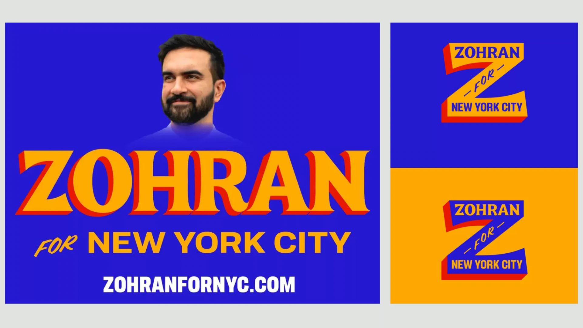
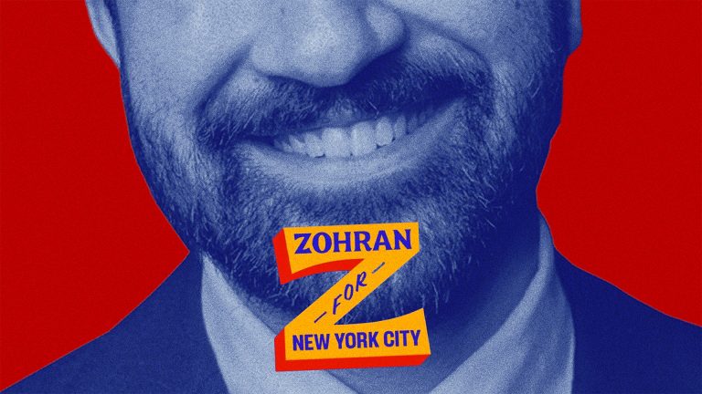
In the other, Mamdani: an explosion of vibrant, vernacular energy, a witty homage to the visual language of the New York streets.
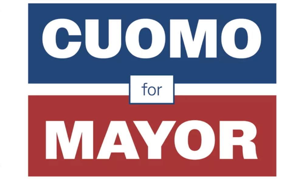
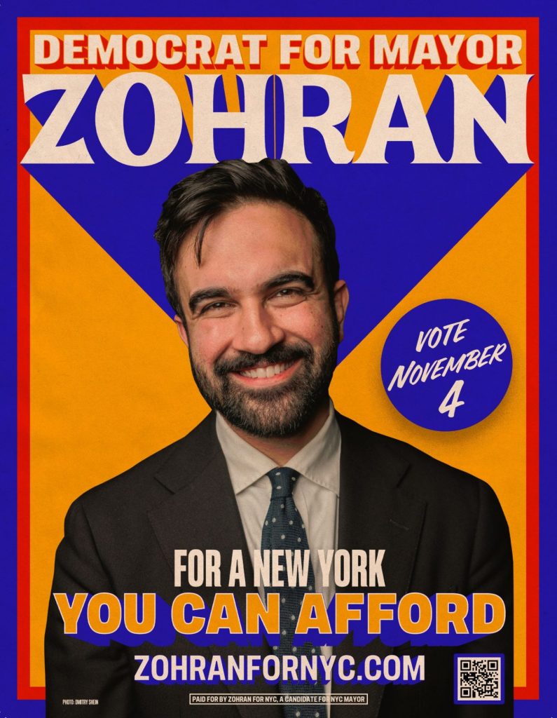
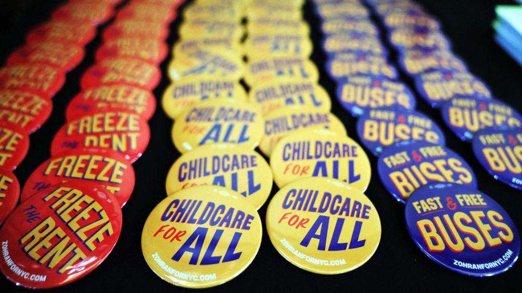

A selection of campaign posters for Zohran Mamdani and, top left, one for Andrew Cuomo. Images: Aneesh Bhoopathy/Gab Visuels Graphéine; Michael Santiago/Getty
Designed by Aneesh Bhoopathy, the campaign steered away from the well-worn cliches of American political communication. Instead of the usual red, white and blue party coding, the design system used a palette of bright orange, blue and red, evoking the city’s Metrocards, taxi cabs, bodega awnings, sports teams and hand-drawn signage. The typography is a friendly mix of brushwork and a warm, mid-century sans. It’s all instantly familiar – a nostalgic nod to New York’s diverse population and history – but also a neat shorthand for a candidate who promised something people-centred, fresh and different.
Suggested Reading

Mamdani, a blip or the future?
Mamdani’s campaign does everything good graphic design should do: it tells a story, evokes a mood, and makes its audience smile – and in this case, vote.
Martin Nicholls is the Creative Director of The New World